Colours: A Display Font That Speaks with Quiet Confidence
It was a Tuesday afternoon—coffee lukewarm, the newsletter header mockup open in Figma, and three fonts already rejected. Not because they were bad, but because they didn’t breathe with the tone of the content: a slow-paced lifestyle blog about mindful routines, seasonal cooking, and small-space gardening. The voice is warm but precise; grounded, not whimsical; intentional, not loud. That’s when I tried Colours.
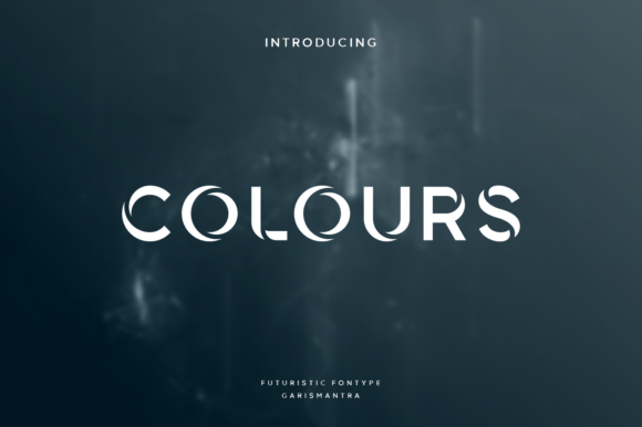
Right away, something shifted. Not in a flashy way—no dramatic kerning adjustments or forced contrast—but in how effortlessly it anchored the layout. Colours isn’t shouting. It’s leaning in. A cool, modern display font with subtle tech-inflected geometry: clean terminals, balanced negative space, and a rhythm that feels both contemporary and quietly human. Its letterforms carry just enough personality to signal intention—without overriding the words themselves. That balance is rare in display fonts, especially ones built for versatility across print and screen.
How It Holds Space in Real Editorial Layouts
I tested Colours across several real use cases—not just as a headline, but as part of a working system. For a digital magazine feature on urban foraging, I used it for the main title and pull quotes. Its even weight distribution and open counters kept readability strong at 36pt on retina displays—and surprisingly legible even at 28pt in tight newsletter graphics. In a printable coaching workbook, it handled chapter openers and section dividers with calm authority, never competing with hand-drawn icons or soft watercolour backgrounds.
What stood out wasn’t just aesthetics—it was structural support. Colours helps readers parse hierarchy without relying on size alone. A single line of text in Colours carries visual weight that invites pause. That makes it ideal for moments where you want attention to land gently: a recipe ebook’s cover title, a wedding guide’s “Your Day, Your Way” opener, or a course PDF’s module headers. It doesn’t demand attention; it earns it by feeling considered.
Where It Fits—and Where It Doesn’t
Let’s be clear: Colours is not a body font. Its expressive character, while refined, isn’t designed for extended reading. I tried it at 16pt in a long-form blog post—and while it looked striking in the first paragraph, fatigue set in by the third. It’s also not ideal for dense captions, footnotes, or small-print legal disclaimers. Those need neutrality, not nuance. But that limitation is actually its strength: Colours knows its role. It’s a display font, first and foremost—meant to frame, highlight, and elevate.
In practice, that means pairing it thoughtfully. For editorial layouts, I consistently paired Colours with a warm, highly readable serif (like Literata or Adobe Garamond) for body copy—creating a quiet dialogue between voice and vessel. For digital-first newsletters, a clean, low-contrast sans serif (think Inter or Manrope) worked beautifully for subheads and callouts. The contrast wasn’t jarring; it was clarifying. Colours sets the mood, and the supporting typeface carries the meaning.
A Mood That Translates Across Formats
One unexpected win was how well Colours held up in print. I exported a few pages of a seasonal planner as a high-res PDF and printed them on uncoated matte stock. The font retained its crispness without looking brittle—its strokes neither too thin nor too heavy, its spacing generous but not airy. On screen, it rendered cleanly across Chrome, Safari, and iOS Mail clients. No pixelation, no awkward hinting issues—even at smaller display sizes in mobile newsletter headers.
Its editorial appeal lies in this duality: it feels modern enough for a digital magazine cover, yet warm enough for a handmade printable. It doesn’t lean into retro nostalgia or futuristic abstraction. Instead, Colours occupies a grounded middle ground—contemporary, but not cold; expressive, but not eccentric. That makes it unusually adaptable for independent creators building cohesive brand identity across formats: a blog header, an ebook title page, a workshop slide deck, a social media graphic banner.
Practical Notes Before You Use It
Before integrating Colours into templates, ebooks, or client work, take a moment to review what’s included. Check whether the package offers multiple weights (light, regular, bold), stylistic alternates, or discretionary ligatures—these can add subtle polish to titles or logos. If your audience includes multilingual readers, verify Latin Extended-A support, especially if you publish recipes with accented ingredients or wedding guides with non-English names.
Licensing matters, too. As a premium font, Colours typically comes with commercial use rights—but always confirm whether your intended use (e.g., bundling in a Canva template, embedding in a web app, or reselling as part of a printable bundle) falls within the license terms. Most reputable font vendors provide clear documentation; when in doubt, reach out directly. And if you’re designing for accessibility, remember that display fonts like Colours are best reserved for large-scale, short-text applications—never for UI labels, form fields, or navigation menus where clarity and speed are paramount.
Why It Stays Open on My Design System
Colours hasn’t replaced my go-to serif or sans serif. Instead, it’s become the quiet anchor I return to when a project needs tonal clarity without cliché. It doesn’t try to be everything—it’s confident in its purpose as a display font. That kind of restraint is rare. In a landscape full of expressive, over-engineered typefaces, Colours stands out by being simply, thoughtfully right for the moment it’s asked to hold.
Whether you’re refreshing a blog header, designing a recipe ebook cover, or setting a pull quote in a digital magazine layout, Colours offers more than visual interest. It offers intention. And in editorial design—where every choice shapes how meaning lands—that’s everything.